Upgrade (step 1) the posts, by putting a "user info" icon in the top right and making it so it toggles the user info.
The user info icon has a badge which shows the number of posts. I will have to dig around in the code more to get the total posts thanks and other badges working; but this is the general idea:
There is too much padding or margin (empty) between the top of the post and the user avatar and icon area; but since I am planning to redo all this code, table-to-divs, I will fix this when I do the rewrite.
Hmmm. I do not have the CSS skills yet to insure proper alignment unless I put the icon on the right and the badges on the left, because of the number of digits in the badges, so I will go with this for now:
I think the request was to change the shape of the cursor when hovering over the Thanks button at the bottom left corner of a post; not just when hovering over the user-info-area at the top right corner of a post.
Also, on a related note, it used to be that the text associated with a URL was always underlined (giving a clear indication that you could click on that area and to go a web page associated with the underlined topic). Now, that text is only underlined if a user hovers over the text associated with a URL (leaving us with no indication that a URL link is present unless someone happens to move the cursor over the associated text).
Where exactly do you want to see link indicators? Normally link indicators like underlines are not used unless it is an area where it is not obvious that a link is in the text, for example in a paragraph in a post. Common best practice today is to use color versus underlines (see CNN, Google News, Google search results, Yahoo News screenshot attachments, these are all links, but none of the links have link indicators ... just 4 of many examples of best practices today to use underlines and other link indicators very rarely and specifically.).
I assume you mean "links in paragraphs inside posts"? Please provide a link to an example area on the site where you want to see link indicators; because I have gone over the site, and I think all the links are very obvious without having underlines all over the site (unless hovered), but perhaps I missed an area?
Actually, I plan to remove the underlines from almost all links which are in lists, fieldsets, etc since best practices today are not to use underlines (CSS: text-decoration: none) for links. I don't know any modern day website which uses underlines for links, but a few do change colors (or use other link indicators) of a link when the link is embedded in a paragraph of text.
If you have a specific area on the site you are interested in having link indicators please post and I'll take a look!
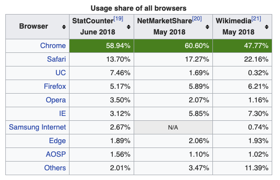
We do not support the IE browser. Sorry. IE does not follow industry standards (consistently) and has so little market share these days, that we cannot spend time to support ID. Sorry again.
Please use either Chome, FF or Safari to view this site.
We officially recommend Chrome as the browser of choice; however we also test on FF and Safari We do not test or modify the code for IE. Again, my apologies for that.
Guess where the link is in this paragraph... If you find the link and follow it to post #3 in the thread, you'll note that there are two paragraphs of text that say:
which contains three links that are invisible unless you happen to roll the cursor over the links. If you do move the cursor over the links, they each appear as underlined text. Until the recent changes, the text appeared as underlined text whether or not the cursor was positioned over the links. (It may have also been a different color as well as underlined, but I am positive that it used to be underlined.)
Yes, in those links, the color of the text is changed and it is this color change which indicates it is a link, not underlines.
This is the correct and expected behavior for links in texts, to use color instead of underlines and to change to a new color (and/or add an underline) when there is a mouseover the link. This is standard best practice for links in text these days.
Do you want to change the color of the link indicator color (in post text) to make it stand out more?
My old eyes didn't see any color difference between the text in a link and text that is not in a link in either FireFox or Safari on macOS High Sierra (version 10.13.6) on a 2 year old or 4 year old MacBook Pro.
Now that you tell me there is a difference, I can see that the link text is a very slightly lighter black if I blow up the text to at least five times its normal size.
So, yes, I very much want to change the color of the link indicator color to make it stand out more!
Sorry for the confusion. My sight isn't as good as it used to be.
I can see green and I can see purple (or magenta). So either one would be OK.
In the macOS Mail application and in Google Mail, links appear as (underlined) blue text; so I'd prefer blue. I'm surprised that both macOS Mail and Google Mail use underlining as well as color when you say that underlining is no longer used for links.
I'd prefer not to use red text to indicate links (if underlining isn't also used) since red is frequently used in posts to show changes between two segments of code in CODE tags.
I use GMail (Google Mail) online and there are no underlines in any links, zero; and the behavior is the same (adds underline and color changes on mouseover).