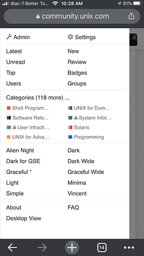
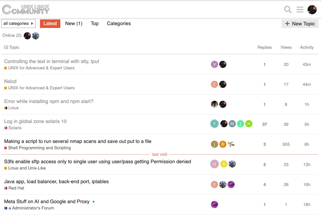
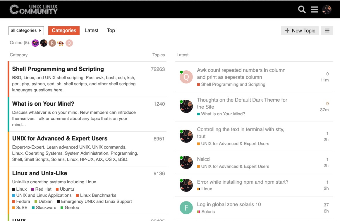
you can always change the theme from the "hamburger" menu in the upper right.
(Image removed, plugin disabled)
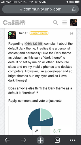
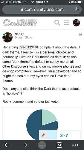
Regarding @big123456 complaint about the default dark theme, I realize it is a personal choice; and personally I like the Dark theme as default; as this same "dark theme" is default or set by me on all other Discourse sites; and on my mobile phones and desktop computers. However, I'm a developer and so bright themes hurt my eyes and so I love dark themes!
Does anyone else think the Dark theme as a default is "horrible" ?
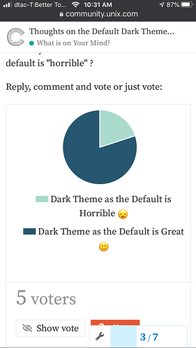
Reply, comment and vote or just vote:
- Dark Theme as the Default is Horrible

- Dark Theme as the Default is Great

0 voters
Well it seems zero people care about this theme question.
Good news
Dark Theme is much easier on the eyes for most people I think.
I do not find the dark theme on the site terrible but would prefer the default light one just because among my visited sites everyone is on the light side  and the transition to dark is very contrasting. And one moment, links in messages for me are more convenient to open by default in another tab. Thanks
So far 4 out of 5 vote to keep the dark theme as the default.
The other good news is logged in users can easily select other themes as well under the hamburger menu.
Not really sure why anyone would complain with so many choices.
Personally speaking I only use the Dark theme.
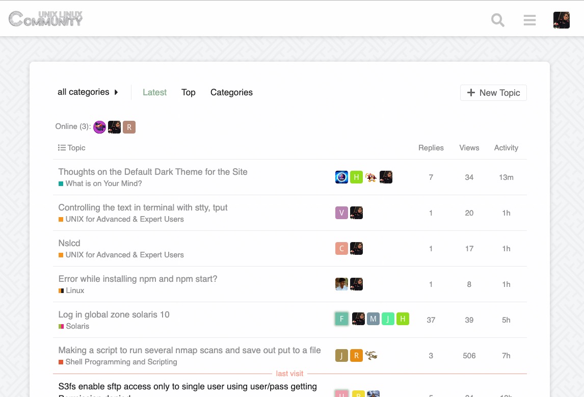
As a test, just changed the default them to "Light", so if you love the "Dark" theme, please select it in the hamburger menu.
Hmm. Changed my mind, and for a test, set the default them to Graceful, because it is easier on the eyes than "Light". Please select your favorite theme in the hamburger menu.
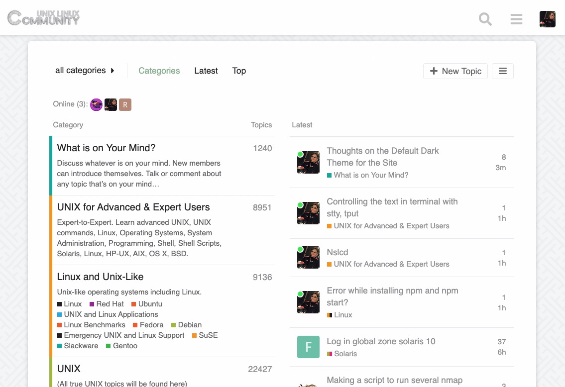
Also, as another test, just changed the landing page to "categories + latest topics";
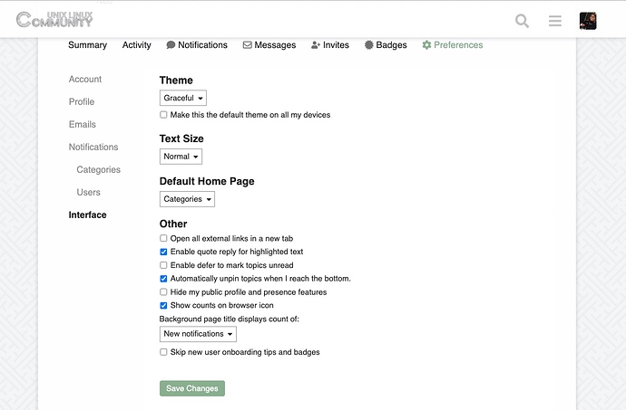
... you can change this back to only "latest topics" in your personal preferences:
Hmmm. Graceful theme has problems on mobile, so I switched the default back to Light and changed the header background to black:
Of course, if you love other themes, please select them in the hamburger menu! 
Hmmm.... personally, I like the Dark theme best; but will leave the "Light" theme as the default for now and select dark in the hamburger menu as my personal preference.
OK!
Back to "Dark for GSE" as the default.
!!
Seems the vast majority prefer Dark as the default.
We sure do!
I Also Prefer Dark Theme.
Dark is Always Best For Anyone who work with screens for long time "" IT People "" and more safe for eyes also.
at least less damage for eyes.
Yeah, I agree with that!
Too much of the bright white real estate gives me "snow blindness" and I have to wear UV sunglasses! ![]()
