Dark Theme: Page is not mobile friendly (by Google Search Console)

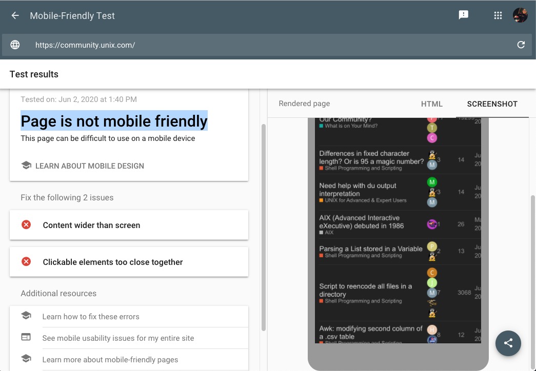
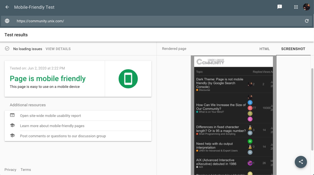
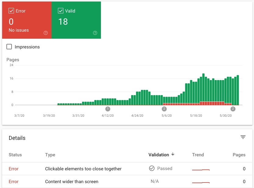
Might need to change the default theme to something other than the "Dark" theme as Google is complaining that the unmodified Dark Theme (OOTB) as our default theme:

Page is not mobile friendly

If we change the default theme, for example, to Graceful, GSE will not complain and Google will report the page mobile friendly.

It's strange that when we look at Google's view (the screenshot) Google is reporting the desktop view as mobile.

Possible to get this fixed, since we much prefer the Dark Theme, as default:

See Also (reported on meta):

1 Like

Because of this GSE complaint about not being mobile friendly, I have temporarily changed the default theme to "Graceful".

If you prefer the "Dark" theme, please select it in your hamburger menu.

Thanks!

Google "Likes" Graceful Theme:

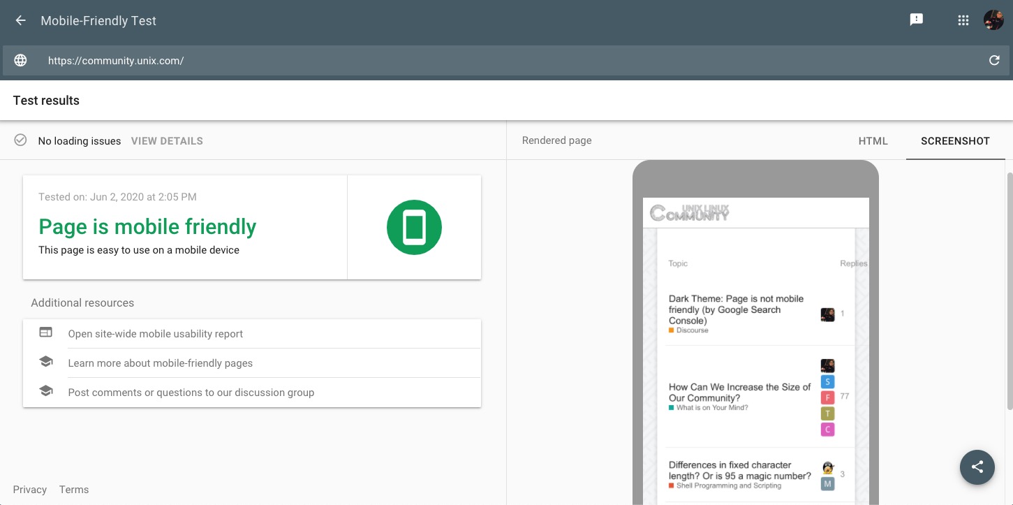
OK, I fixed this, and will revert back to the "Dark' theme as default using this CSS.

Note

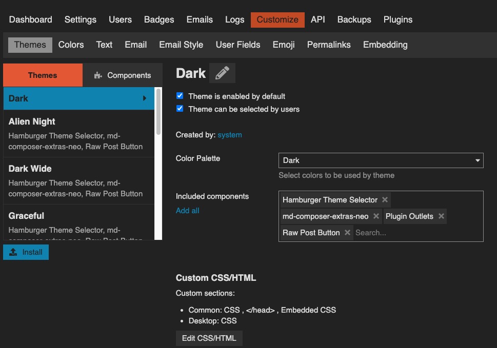
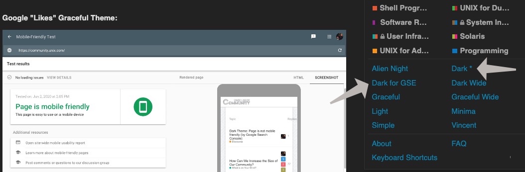
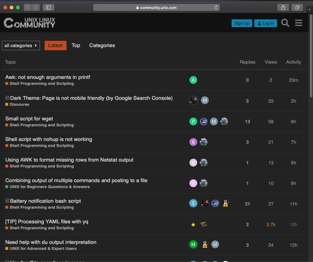
For the original theme (Dark without the extra margin), select "Dark" in the hamburger menu. I moved the GSE friendly "default" theme to "Dark for GSE".

td.posters > a > img{
    margin:2px;
}

1 Like

Did not have any problem with "Dark".
The "Dark for GSE" looks identical, where is the difference?

"Dark for GSE" has this additional CSS:

td.posters > a > img{
    margin:2px;
}

which effects the topic user avatars on the home page (primarily), adding 2px of margin so Google will not flag the page as "not friendly for mobile".

The core problem seems to be a bug or issue with how Discourse detects the Google mobile search engine crawlers (for indexing) because when I look at GSE, the Google view of the mobile page is actually the desktop view (not the mobile view). However, I don't want to breach this subject with the meta team or report a bug, so I simply added the minimal number of pixels Google needed to suppress the error, which was 2px;

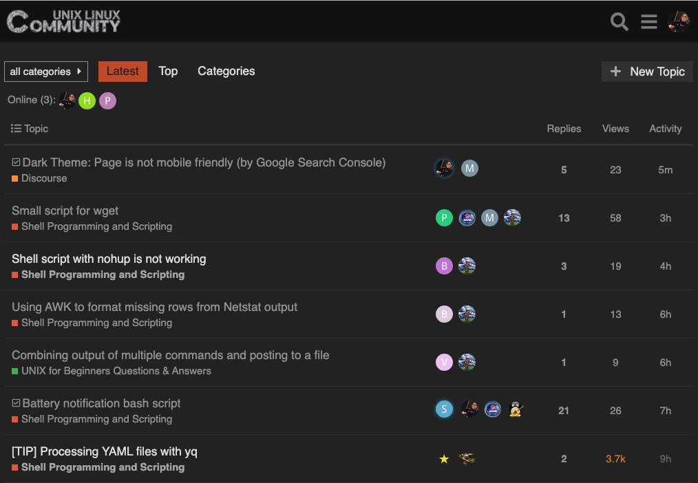
This additional 2px of margin for these avatars causes a small spacing issue with how these avatars are presented (more than four avatars, will push the fifth to a newline in the GSE version); and so I created two themes, one for Google (the default, GSE theme) and one for users (without the 2px).

I think for most registered users, the "Dark" theme is best. "Dark for GSE" is only a workaround for the "not friendly for mobile" issue Google complains about (a default for unregistered users).

1 Like

Update:

Added this CSS to "Dark for GSE":

td.posters > a:nth-child(5) > img{
    display:none;
}

So that only four (not five) user avatar topics will be visible for "Dark for GSE" and so there were be no line break for the user avatars.

And so the CSS for this theme clone is now:

td.posters > a > img{
    margin:2px;
}

td.posters > a:nth-child(5) > img{
    display:none;
}

Actually, in my view, "Dark for GSE" looks really good with only four max user avatars and the extra 2px margin per avatar:

SO, for now, I will not only going to use "Dark for GSE" as the site default, but I'm going to use it "personally" as well. Looks clean.

2 Likes

See also (Safari, default view):

I think this view (with minor CSS modifications above) is cleaner than the original version of "Dark".

1 Like

GSE reports that my fixes worked and all the prior "Mobile Usability" errors are gone:

2 Likes

This topic was automatically closed 60 days after the last reply. New replies are no longer allowed.