Hey you guys,
I have tried almost everything to get this working!
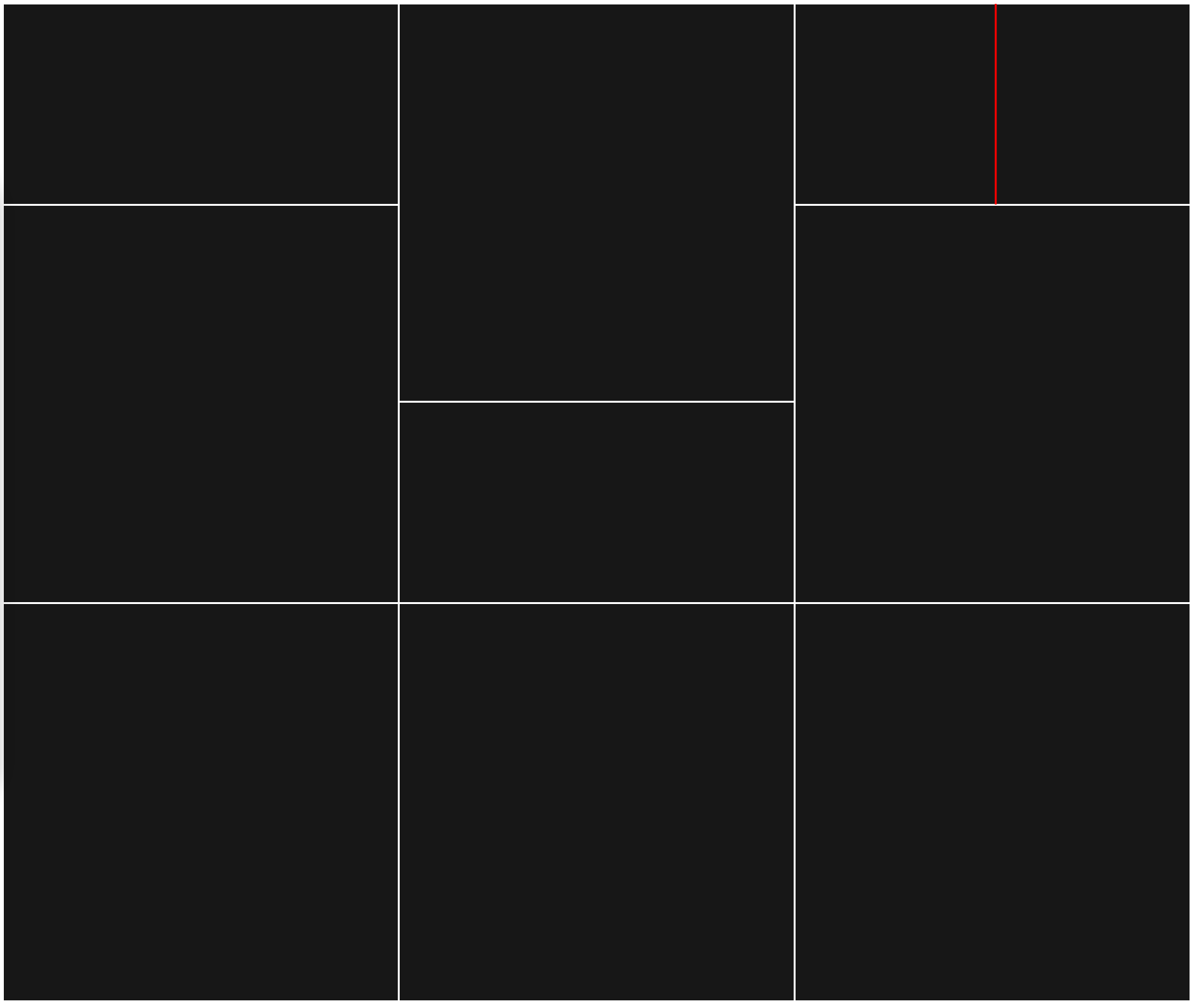
I want to split one child into another two columns see image
Here is my code:
HTML
<!DOCTYPE html>
<html lang="en">
  <head>
    <meta charset="UTF-8" />
    <meta name="viewport" content="width=device-width, initial-scale=1.0" />
    <title>Document</title>
    <link rel="stylesheet" href="unix.css" />
  </head>
  <body>
    <div class="port-images">
      <!-- COLUMN START -->
      <div class="port-column">
        <div class="port-image">
          <img src="/img/example-sm.png" alt="" />
        </div>
        <div class="port-image">
          <img src="/img/example.png" alt="" />
        </div>
        <div class="port-image">
          <img src="/img/example.png" alt="" />
        </div>
      </div>
      <!-- COLUMN END -->
      <!-- COLUMN START -->
      <div class="port-column">
        <div class="port-image">
          <img src="/img/example.png" alt="" />
        </div>
        <div class="port-image">
          <img src="/img/example-sm.png" alt="" />
        </div>
        <div class="port-image">
          <img src="/img/example.png" alt="" />
        </div>
      </div>
      <!-- COLUMN END -->
      <!-- COLUMN START -->
      <div class="port-column">
        <div class="port-image">
          <img src="/img/example-sm.png" alt="" />
        </div>
        <div class="port-image">
          <img src="/img/example.png" alt="" />
        </div>
        <div class="port-image">
          <img src="/img/example.png" alt="" />
        </div>
      </div>
      <!-- COLUMN END -->
    </div>
  </body>
</html>
CSS
/* Portfolio FLEX START */

.port-images {
  display: flex;
  gap: 3px;
}

.port-column {
  display: flex;
  flex-direction: column;
  gap: 3px;
}

.port-image img {
  width: 100%;
  height: 100%;
  flex-grow: 2;
  object-fit: cover;
}

/* Portfolio FLEX END */

@media screen and (max-width: 768px) {
  .port-images {
    flex-direction: column;
  }
}
Any help gratefully received
Zigs
@ziggelflex , Hi, can you show the expected result of this (obviously, you'll need to manually manipulate to show that).
( your pics are black on black btw, so nigh on useless) and don't show which child you want to alter.
thks
Effectively I want to put another flex box in there with two flex columns
Hi, I might be missing the obvious, what does it look like after its been split ? 2 becomes 3 or two becomes 4 ?
can u upload the .png files
png files were uploaded in original post.
Thanks for helping.
This may help I want the flex masonry layout to look like this:
It's not the end of the world if I don't get this sorted but I would like to.
Thanks
Ziggy
@ziggelflex tks,
not at a pc atm, will see if i can actually be of some help asap.
@ziggelflex , is something along ?
ziggflex.html (2.1 KB)
AFK at the moment. Will check out later. Thanks @munkeHoller
Ziggy
Well done @munkeHoller Works amazing.
One thing I need a gap of 3px between [split col 3][box 1][col 2] and [split col 3][box 1][col 1]
See attached HTML and CSS:
ziggflex.html (2.3 KB)
Any more tricks up your sleeve?
Ziggy
No worries worked it out
.split-columns {
  display: flex;
  flex-wrap: wrap;
  direction: rtl;
  gap: 3px;
}

.split-columns > div {
  flex: 1;
}
Big thanks to @munkeHoller. Took a lot of fiddling but I now have the desired effect. Your code was awesome. Took me a little while to understand, not used to flex or flex-box.
Peace Zigs
P.S.
Just incase anyone wants two understand what result I was looking for, attached is amended code:
<!DOCTYPE html>
<html lang="en">
  <head>
    <meta charset="UTF-8" />
    <meta name="viewport" content="width=device-width, initial-scale=1.0" />
    <title>ziggiflex</title>

    <!-- this style block can go in a separate .css stylesheet, here its only for simplification -->
    <style>
      body {
        margin: 0;
        padding: 0;
        font-family: courier;
      }
      .container {
        display: flex;
        /* height: 100vh; */
        padding: 0 6px 0 6px;
        gap: 3px;
      }
      .column {
        flex: 1;
        /* padding: 20px; */
        /* border: 1px solid black; */
        display: flex;
        flex-direction: column;
        gap: 3px;
      }

      .box {
        flex: 1;
        aspect-ratio: 1 / 1;
        gap: 3px;
      }

      .box-h {
        display: flex;
        aspect-ratio: 2 / 1;
        gap: 3px;
      }

      .fill {
        width: 100%;
        height: 100%;
        background-image: url('img/example.png');
      }

      .split-columns {
        display: flex;
        flex-wrap: wrap;
        direction: rtl;
      }

      .split-columns > div {
        flex: 1;
      }

      .block {
        width: 100%;
        height: 600px;
        background-color: blue;
      }

      @media screen and (max-width: 768px) {
        .container {
          flex-direction: column;
        }
      }
    </style>
  </head>
  <body>
    <div class="container">
      <div class="column">
        <div class="box-h">
          <div class="fill"></div>
        </div>
        <div class="box">
          <div class="fill"></div>
        </div>
        <div class="box">
          <div class="fill"></div>
        </div>
      </div>
      <div class="column">
        <div class="box">
          <div class="fill"></div>
        </div>
        <div class="box-h">
          <div class="fill"></div>
        </div>
        <div class="box">
          <div class="fill"></div>
        </div>
      </div>
      <div class="column">
        <div class="box-h split-columns">
          <div class="port-image">
            <div class="fill"></div>
          </div>
          <div>
            <div class="fill"></div>
          </div>
        </div>
        <div class="box">
          <div class="fill"></div>
        </div>
        <div class="box">
          <div class="fill"></div>
        </div>
      </div>
    </div>
    <div class="block"></div>
  </body>
</html>
@ziggelflex , sorry, grandparenting usurps support  , glad you worked it out