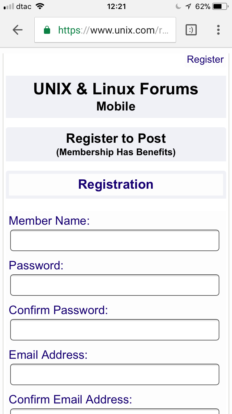
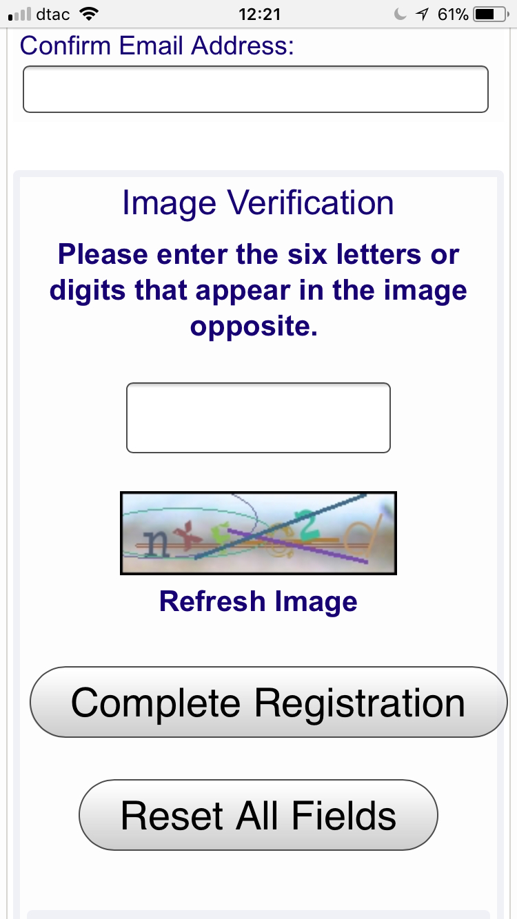
Prototype Mobile Registration Page, which for now I have greatly simplified.

Here is the Prototype Mobile UNIX Man Page Sets Landing Page
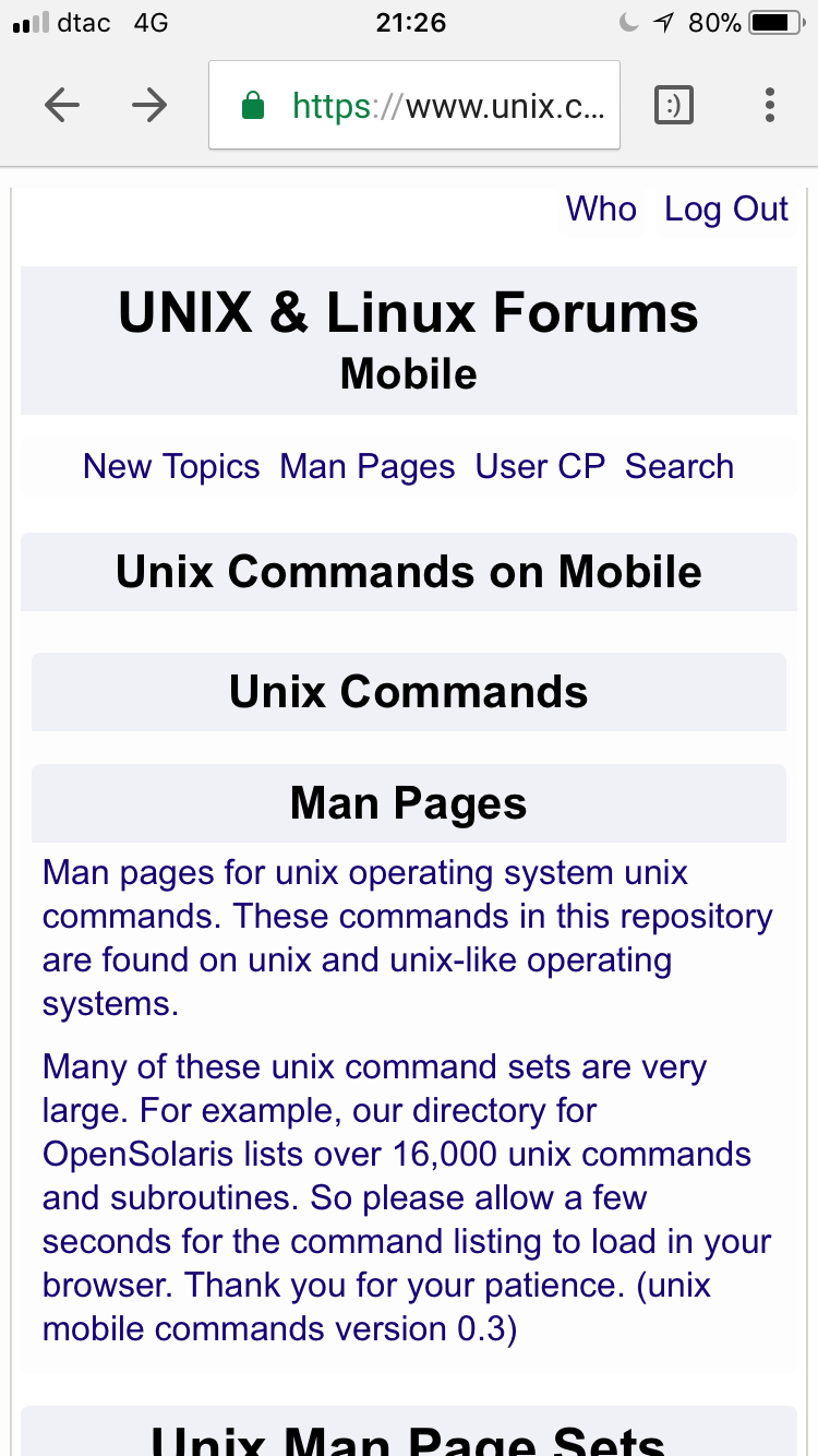


I need to also redesign the man page repositories for each set and do the same page for linux.
This is a lot of boring CSS and PHP work!!! LOL
Here is the same type of Mobile Prototype for Linux Commands:

Just need to redesign the pages for each man page set for each UNIX and Linux set on the server and this manpage prototype for mobile is "done for now".

Close to the finish line with this first phase of the mobile redesign. Need to adjust fonts and style here and there and rework some man page repositories.
Most of the user account and user options will be left to the desktop version as well as most of the moderator and admin pages.
Overall I find the mobile pages easy to read, edit, reply and post. The code tags work as weill as expected with horizontal swiping.
Its a good first start at a usable mobile site I think....
2 Likes
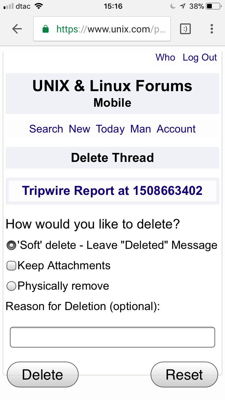
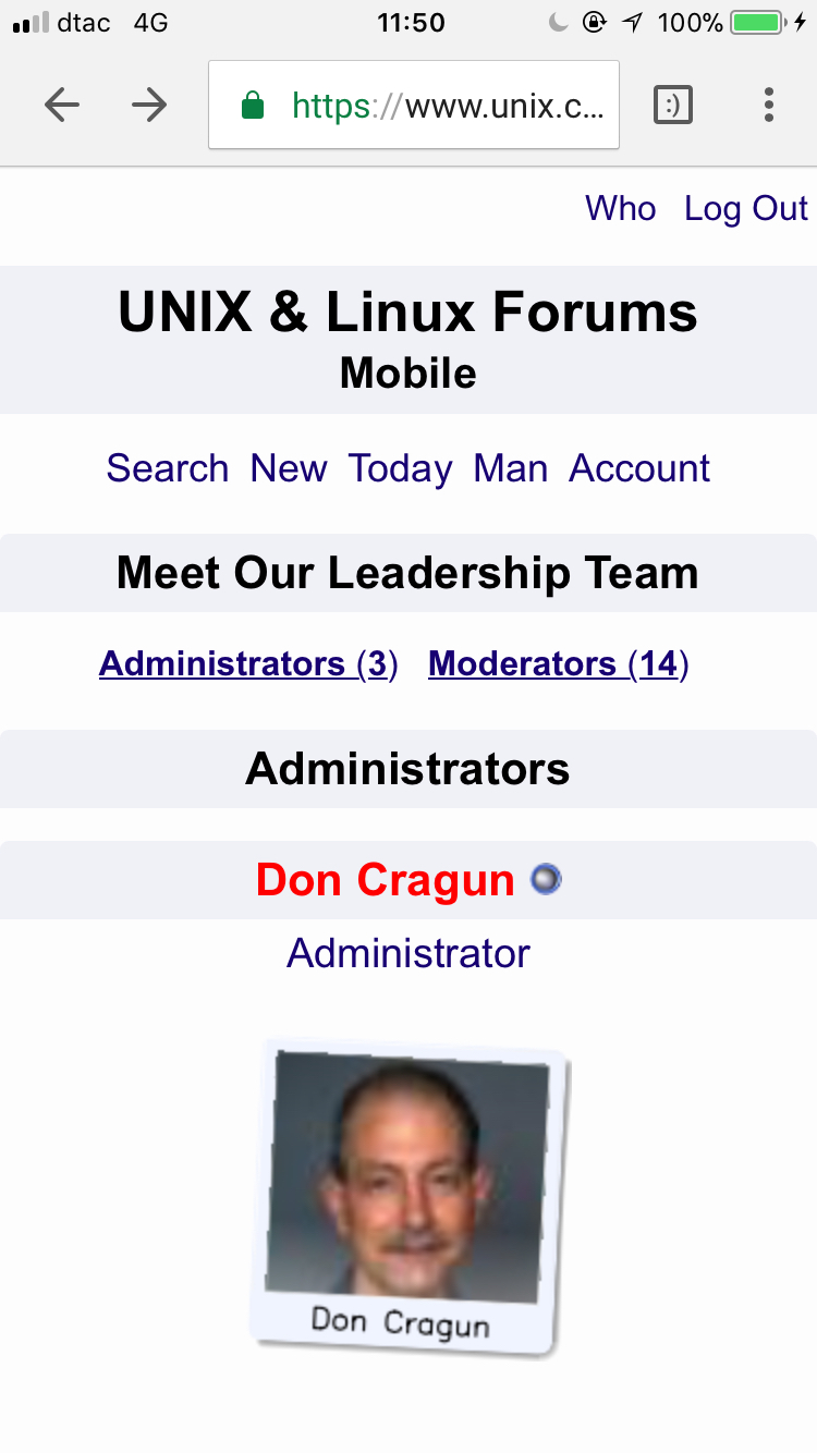
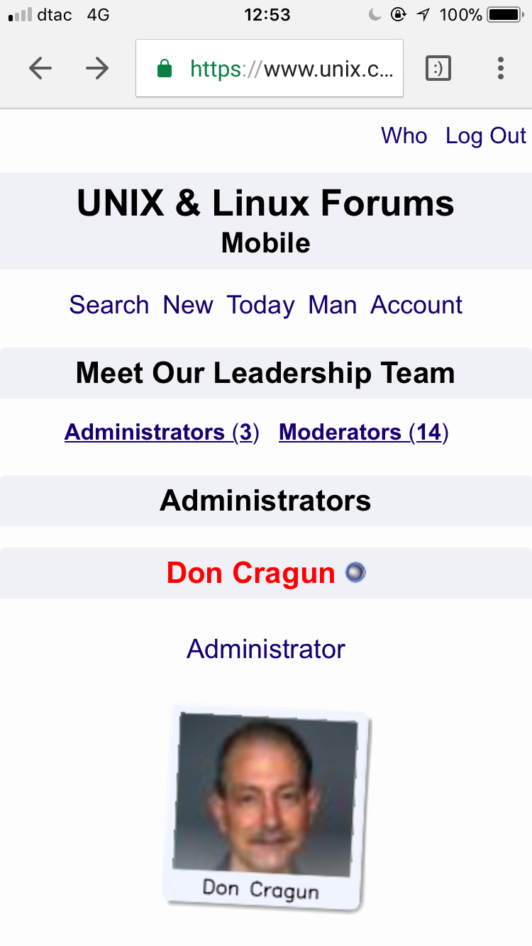
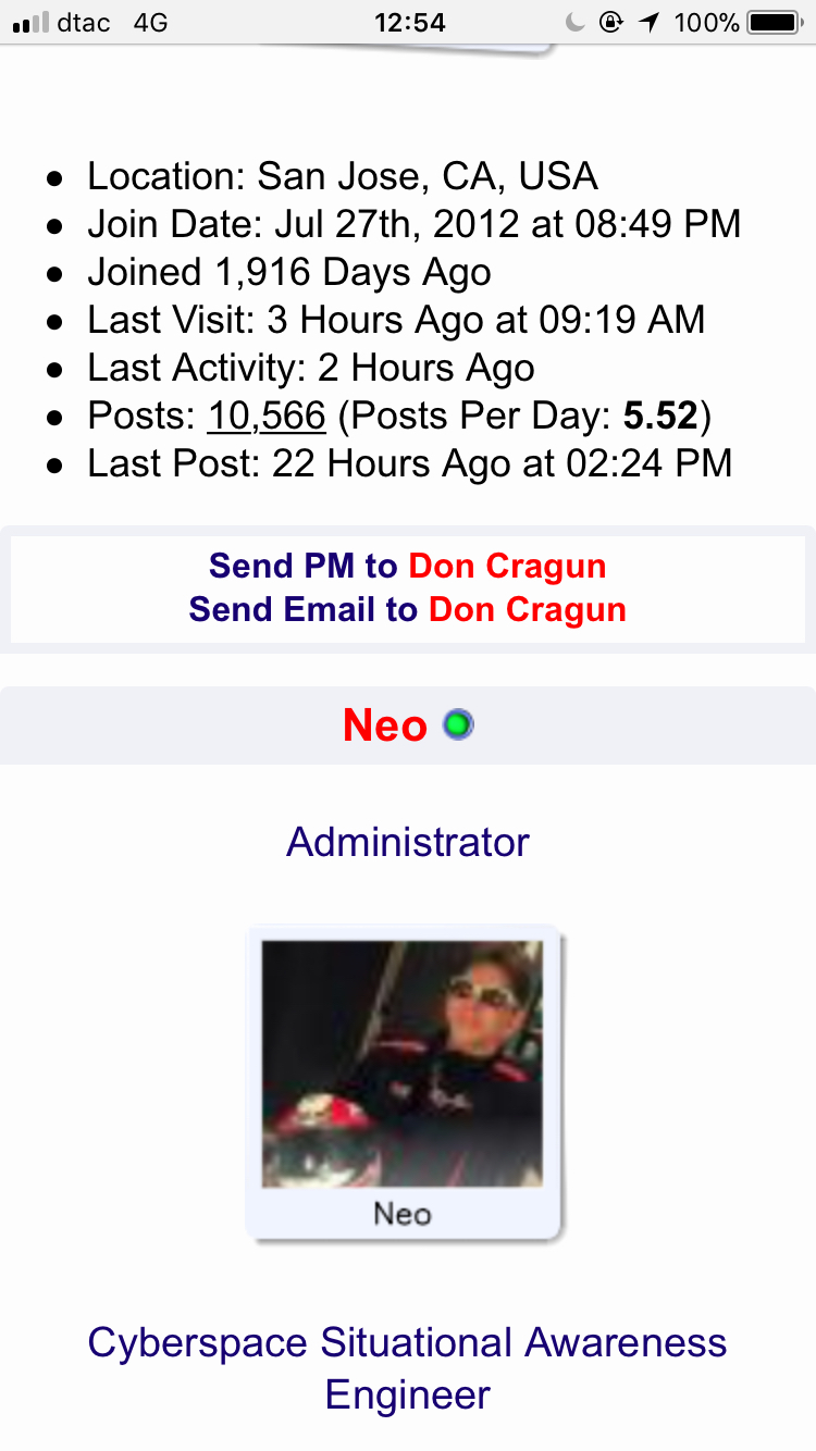
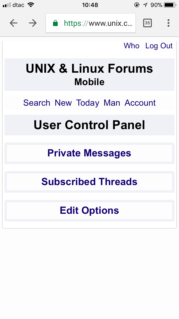
Here is the Mobile Prototype for the mods and admins. I need to fix some of the formatting (make it prettier) and change the buttons (the legacy buttons are ugly) for sending email and pms, but basically this page is "mobile friendly" now:


I did not realize changing HTML tables to CSS style DIV and SPAN tags would be so much fun! LOL 
3 Likes


Please note there is currently a small bug in the newly enabled mobile code to save the user options on mobile.
Bug in Message Editor Interface Code in Mobile View
Basically, the Message Editor Interface resets to text when saved in mobile view; even though their is no option in the mobile user cp to change or reset this option.
It's a bug we will need to squash; in the meantime, if this bug happens to a mobile user; you can reset it back in the desktop user CP easily.


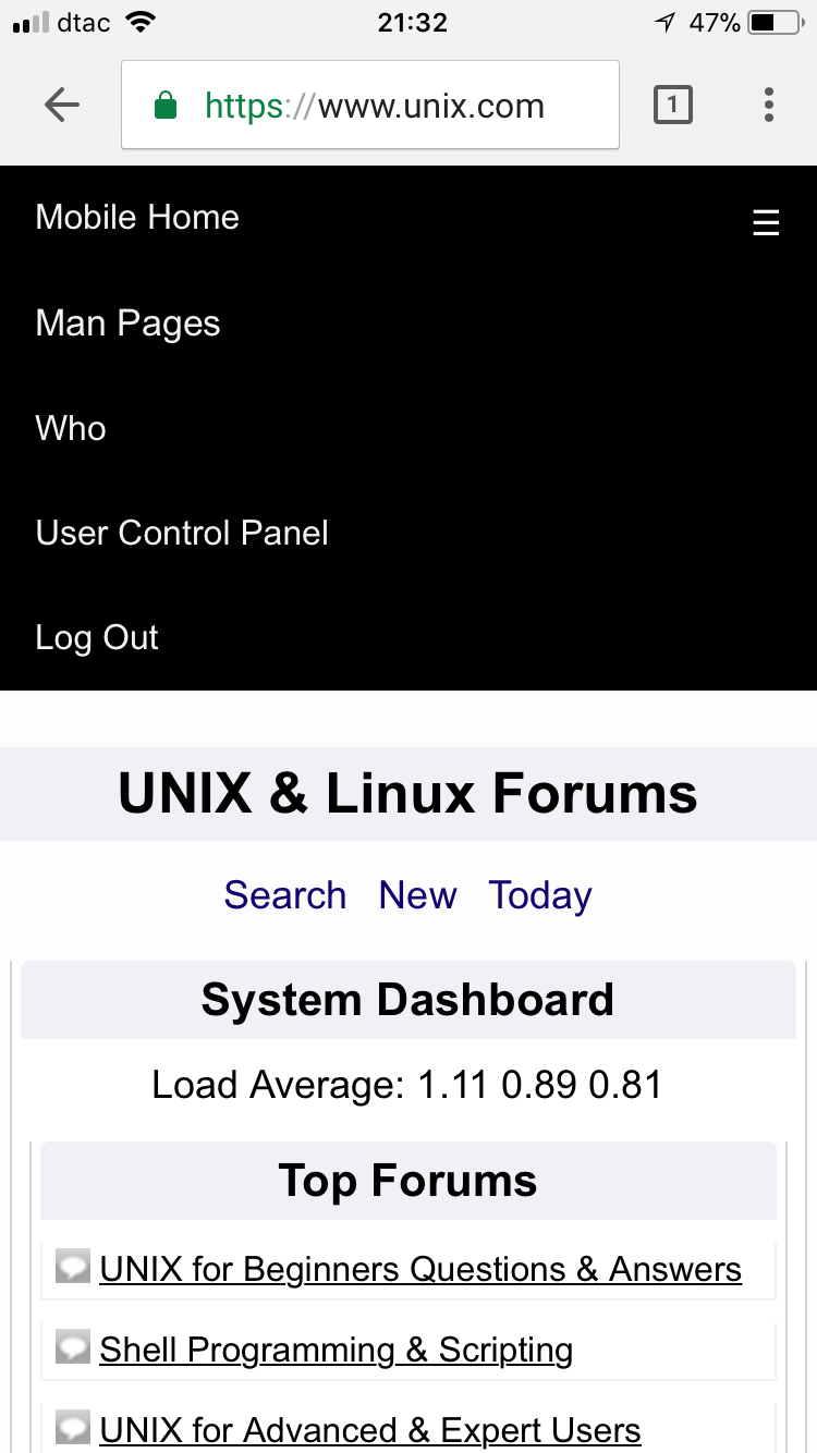
Here is the Mobile Prototype JS Sidebar:

Open:

I like this sidebar better than the topnav from the earlier post.
The sidebar works great for me on my kit.
(I noticed yesterday that the top of page "Who" and "Logout" were missing which was a problem - couldn't logout!!!)
I waited before posting as I guessed you were changing something.
Thanks for waiting. Yes, I was changing on the fly. I'm happy with the new side bar.
I may add some JS code to make the top nav bar (with the sidebar icon and forum logo) stick to the top even when scrolling around, if people think it is better to have the top bar floating at the top all the time.
Also, I might add a bottom bar for mods where they can easily do moderator functions.
Any places where you think a new menu like this "top", "side" or "bottom" would be helpful (in mobile or desktop), please let me know.
Thanks.
Off topic but probably related.......
Logout button on my PC screen isn't working now.
Should not be related because it's a different template.
I just checked and the PC version (logout and in) works find from here.
Okay, thanks for checking.
'Logout' still not working here. Perhaps the problem is here.
All other nav buttons working fine except that one. Used 'logout' several times today already with no problem. Strange.