From Prototyping New Responsive Mobile for UNIX.COM - Phase II, we move to Phase III.
Basically, the core prototype for every day browsing the forums, replying, posting and editing on mobile is nearly finished with the exception of a few formatting issues with regard to rare system messages or less obvious pages which need a bit of formatting to match the new style. I have done all my personal testing on the iPhone 6s and iPhone6+.
In phase three, I plan to work on Javascript sliders for page navigation so we can slide back and forth with gestures on mobile versus clicking to advance to the next page in long threads with many posts or forum views of many pages of discussion threads. Also, in Phase III I plan to fix bugs and correct formatting errors and add any pages (port to mobile) that members really want. Considering most all users prefer desktop because it's easier to prototype code on the desktop (by far), mobile is mostly for reading and catching up on the go or making a quick reply which does not require coding.
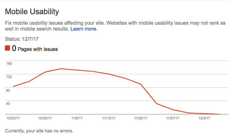
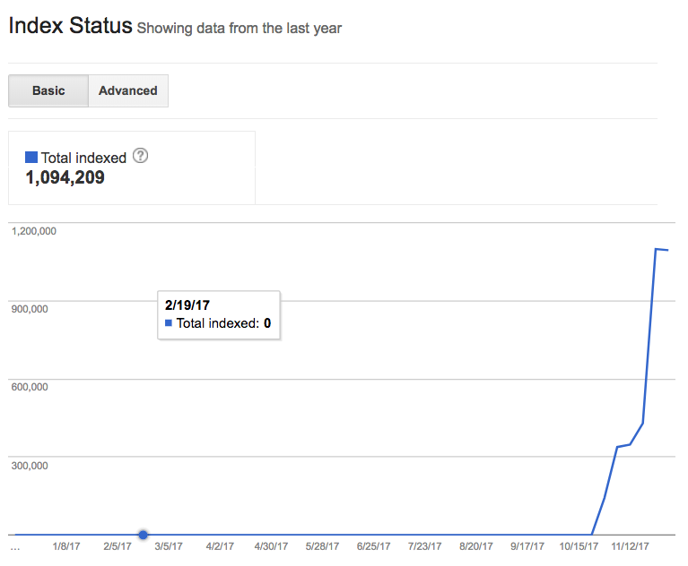
Status: Mobile usage is slowing increasing, day-by-day, week-by-week, since the new mobile prototype changes. Google shows nearly 100% "mobile friendly" for all indexed pages, currently over 1,000,000. However, I have "forced" this in some cases and there is a bit more work to be done in the long term (99% of mobile users will not notice this).
At this point in the prototype development, I would like to encourage all users who have mobile phones to visit the forums on mobile from time to time, try out all the new icons and buttons, read (and reply) and comment in this thread.
All comments, even negative or harsh are OK. Praise is also appreciated as it was a lot of work to get this code to this stage.
Please keep in mind that the mobile version is not meant to have the richness of the desktop version. The mobile version does not have editor buttons for code tags (yet) and other nice to have editor or moderating features. Code tags need to be written by hand "
```text
" and "
```
for example . For me, this is no problem at all, but for people who are new members and not familiar with how to write out these tags (often quicker than using prefab buttons), it's not perfect yet. I will this fix in the future as usage goes up.
So, please visit with mobile from time to time, when you are on the go, or relaxing away from your desktop or notebook, and if you see any bugs, formatting issues, or would just like to suggest some features, please do so now before I enter into development Phase III of this "mobile prototype" project.
Thank you.
PS: All Tapatalk support has been disabled and delated, permanently.