I use this gnuplot script ( I'm bound to use the 4.6 version of Gnuplot ) :
reset

FILE = "LINEARFIT.txt"
set datafile separator ";"
set xdata time
set timefmt "%Y-%d"
set format x "%Y\n%d"

plot FILE u (StartDate=timecolumn(1)):0 index 0 every ::0:0:0

EndDate = strptime("%Y-%d","2020-20")
f(x) = a*(x-StartDate) + b
FIT_LIMIT = 1e-8
fit f(x) FILE u (timecolumn(1)):2 via a,b

set terminal png truecolor size 900,520 background rgb "#eff1f0"
set output "/xxx/xxx/xxx/xxx.png"
set xrange[StartDate:EndDate]
set grid xtics, ytics
set yrange[0:30]
set format y "%g"
myLabel(n) = sprintf("%g",n)

plot FILE u (timecolumn(1)):2 w lp pt 7 lc rgb "red" notitle, \
'' using 1:2:(myLabel($2)) w labels offset 0,-0.5 notitle, \
      f(x) ti "linear fit with extrapolation"
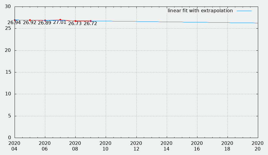
Can you tell me why, on the x axe, the values are displayed "Two by two" : 2020-04, 2020-06, 2020-08, 2020-10, 2020-12, 2020-14, 2020-16, 2020-18, 2020-20... While I want 2020-04, 2020-05, 2020-07, 2020-08, 2020-09, 2020-10, 2020-11 ,2020-12 ....
When I see 2020-4 I assume the month april.
When I see 2020-20, I wonder which month that should be.
Anyhow, I would phrase it like ; that you need a 'closer' endrange.
See, everything that happens, happens between 4th and 9th. so within 5 - while the total range is 16.
For a 1-1 intervall, you would need to 'zoom in' to like a total range of 10 or less.