Please let us know your thoughts on our new community for unix and linux lovers, especially on mobile.
Its great on mobile, tons and tons faster than the old site. (Switzerland, fibre 4g)
I just wish that on desktop/latop devices, it would be slightly wider...
Example, if the 'reading part' would be as wide as the 'writing' part.
I belive nowadays it's save to assume that most ppl probably have a fullhd screen, so to display data and only use like 50% of the total width, but writing a post uses like 75-90% of the total width..
Seems a bit.. unbalanced.. to me.
I'm an old school guy... So I'm not yet sure wether I like this 'list-like' design over the well known forum feeling..
So I feel like i'd prefer Categories - Unix Linux Community more as the 'main welcome page'.
My 2 cents
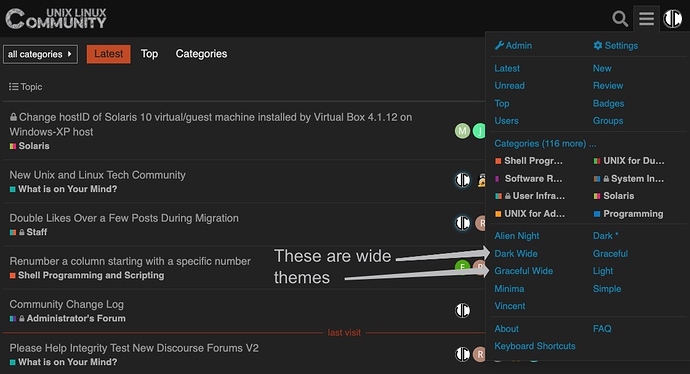
Just pick a wide theme when you want wide.
Use the theme picker in the hamburger menu and report back.
@sea I'm am not picking on you, but over the years I have noticed that a lot of people use the term "old school" when what they really mean is "to lazy or not interested to explore the features and learn new things on new systems" 
The wide themes here are a click away and very easy to find.
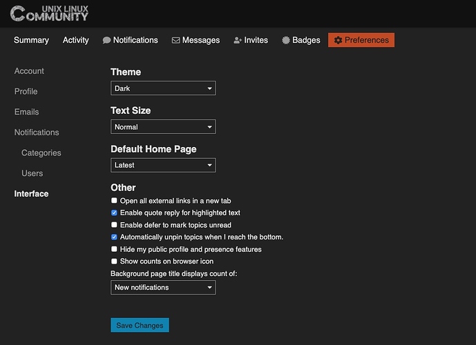
Hi @sea... here you are again (sorry, I'm not picking on you) using "old school" when what you really mean is "I am too lazy or not interested to explore features and open my own profile to set my preferences".
As use can see, in about two clicks and an interest to explore, you can easily set your preference home page:
How about we drop the term "I'm old school and ..... " and just spend time learning the features of this very powerful and modern system.
Thanks!
This topic was automatically closed after 14 days. New replies are no longer allowed.

