Finally making some progress on getting rid of the 10 year old buttons with modern day fonts and icons thanks to a responsive web design tutorial by Brad Traversy who's video pointed me to Font Awesome.
The buttons and icons were pretty easy to implement but it too me a number of hours (embarrassingly enough) to rewrite the 10 year old Javascript vBulletin code so "multiquote selection" worked. But it works now! LOL
New hacked code which could be better, but nevermind, it works fine I think:
function mq_init(D) {
    var C = fetch_cookie("vbulletin_multiquote");

    if (C != null && C != "") { C = C.split(",") }
    else { C = new Array() } var E; var A = fetch_tags(D, "i");
    for (var B = 0; B < A.length; B++) {
        if (A.id && A.id.substr(0, 3) == "mq_") {
            E = A.id.substr(3); A.onclick = function (F) { return mq_click(this.id.substr(3)) };
            change_mq_image(E, (PHP.in_array(E, C) > -1 ? true : false))
        }
    }
}
function mq_click(F) {
    var D = fetch_cookie("vbulletin_multiquote");
    var B = new Array(); var E = false; if (D != null && D != "") {
        D = D.split(","); for (C in D) {
            if (!YAHOO.lang.hasOwnProperty(D, C)) { continue } if (D[C] == F) { E = true }
            else { if (D[C]) { B.push(D[C]) } }
       }
    } change_mq_image(F, (E ? false : true));
    if (!E) {
        B.push(F);
        if (typeof mqlimit != "undefined" && mqlimit > 0) {
            for (var C = 0; C < (B.length - mqlimit); C++) {
                var A = B.shift();
                change_mq_image(A, false)
            }
        }
    } set_cookie("vbulletin_multiquote", B.join(",")); return false
}
function change_mq_image(C, B) {
    var A = "mq_"+C;

         if (B == true) {
            if($("#"+A).hasClass("far"))
            {
              $("#"+A).removeClass("far");
              $("#"+A).addClass("fas");
        }
            }
        else {
            if($("#"+A).hasClass("fas"))
            {
              $("#"+A).removeClass("fas");
              $("#"+A).addClass("far");
            }
        }
  }
//mq_init(fetch_object("posts"));
I will implement this for everyone when I am not so tired for getting this to work.
Yeah! Finally we are moving off those terrible legacy vB buttons!!!!
The first step of replacing the legacy vB buttons with fonts icons from Font Awesome is done.
Of course, there is a lot of legacy code and buttons, so I might have missed something, in fact I'm sure I did; so if you see any old legacy buttons please post a link and a screen shot attachment (if you can).
Also, I want to again thank Brad Traversy and his awesome YT channel, Traversy Media, for pointing me in this direction.
I'm not seeing old icons, but I am seeing a little bit of strange behavior:
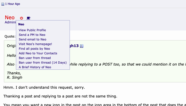
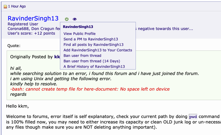
When I click on the poster's name in the upper left corner of a post, I believe I used to get a drop down menu of things I could do like view all posts by that user, visit that user's profile, etc.; now clicking on the poster's name is a no-op. Please reinstate the old behavior.
When I hover over the new Thanks icon in the lower left corner of a post, there is no text indicating what that icon does. Please add something like "Give thanks to the user who submitted this post".
When I hover over the new edit/delete post icon in the lower right corner of a post, I see the text "Edit/Delete Unix or Linux Message". To me, that sounds like it will allow me to edit or delete a mail message in my UNIX and Linux Forum mailbox. Consider changing the text to something like "Edit or Delete this post".
When I hover over the new quick reply icon in the lower right corner of a post, I see the text "Quick reply to Unix / Linux message". To me, that sounds like it will allow me to reply to a mail message in my UNIX and Linux Forum mailbox. Consider changing the text to something like "Reply to this thread without quoting any posts".
I never understood how multi-quote was supposed to work, but after playing around with it for about an hour this afternoon I think I have figured it out (although there is some inconsistent behavior if I select and deselect some posts for multi-quoting without actually posting a reply). Consider changing the text you see when you hover over the new multi-quote icon in the lower right corner of a post from "Multi-Quote Unix/Linux Message" to something like "Add this post to the list of posts to be Multi-Quoted" (when the post has not been selected) and "Remove this post from list of posts to be Multi-Quoted" (when the post has been selected).
When I hover over the new quote reply icon in the lower right corner of a post I see the text "Unix or Linux Quote Reply". Consider making this a little bit clearer for new (and experienced) users by changing the text to something like "Quote this post and any posts selected for Multi-Quoting in a Reply to this thread".
Also can we make THANKS button looking like pressed already in case someone has given THANKS on a post(apologies if I am missing here something) but it doesn't look like that as of now. It can help if that looks like already pressed kind of thing.
Also can we have a THANKS icon while replying to a POST too, so that we could mention it on the header of post itself?
Halfway done. TODO: Change mouse over text after selected (temporarily the text is Add/Remove ... blah blah)
Done (but I this icon (far bottom right) does not add any selected "multi-quoted". It is strictly a "quick reply without quotes kinda action).
Thanks for all your very detailed comments.
It's pretty easy to fix the kind of things when your comments are so precise, as it takes less time to fix the issue than to understand what you want to fix.
Much appreciated Don! Thanks!!
TODO:
Transfer Bits to a Poster when the "Thanks You / Like Button" is pressed, or maybe add a quick popup menu to ask "how much to you like it? how many bits do you want to give? LOL" or something that that. Or maybe just keep it simple or as it is?
Yes sure Neo, just recognized THANKS button is dis appearing after one gives it at that time but once I am going to that post again even I have given thanks to someone could see it still see screen shot.
2nd point: I am not able to insert image for it INSERT IMAGE icon is NOT giving me BROWSE option to go through to my local system.
3rd point: Thing is it should not be visible to a person who has posted the post, if I am not wrong it is visible right now for the person's OWN post itself too.
4th point: Yes, while replying/quick replying we could add THANKS ICON(like many other icons Redhat, Idea, BUG FIX etc etc) there too, if someone wants to add it in header.
Apologies not able to insert screen shots for points here.
EDIT: Also just recognized icon for forum advisory has been changed, IMHO previous ICONS were/are awesome(not denying this one but previous ones were like medals for forum advisory and MODs which were NOT at all old fashioned in IMHO)
I can insert images no problem. The image icon is for inserting images in links.
If you want to insert an image as an attachment you need to "Go Advanced" and insert attachments (up to five, best if they are the same type (best not to mix movies and image, for example).
However, the way I prefer to add images is to add the image to my album and then insert the image using the bbcode for the album image.
In other words, I insert a lot of images in my posts (from my local desktop and don't have any problems at all).
Yeah, I broke this with a typo when fixing some other thing. It's back to normal now.
OK. Maybe someday when I redo the editor code. This is not a prior for now.
Screenshots are easy to insert if you just insert them in the ways that the forum provides.
Please use the standard methods provided.
Add to your album from your local device and insert using the link provided, or;
Add as an attachment using the advanced editing option (not quick reply mode).
Thanks
OK. I might change them back if anyone else wants the images (medal and fancy knot) for staff and advisors back.
I'm OK either way, and don't have strong feelings either way, so let's see if anyone else has a feeling or opinion about this.
OK. Done. Thanks again for the level of detail and for helping with all the kind of details.
In fixing this, I moved the action over the user status icons versus over the username and link, so just click on the online status icon or other badges next to it to get to the user menu as before:
I've found a few nits, but I need some sleep before I'll be able to post a coherent set of suggestions for changes... I'll post a follow-up message this afternoon.
I am not a big fan of a coffee cup icon as an indication that a poster is an advisor, moderator, or administrator. (I realize that the tag line under the user's name usually gives the poster's position in the hierarchy, but that isn't true if the poster has used bits to pay for a personalized tag line.)
Item 1 is mostly fixed. When I click on a poster's name, it now goes to the poster's public profile. But, when I hover over the poster's name, there is no text indicating what will happen if I click while I'm there. Please display text similar to "Go to user name's public profile" when I hover over the poster's name.
Item 2 is fixed.
Item 3 is fixed.
Item 4 is partially fixed. When I hover over the quick reply icon, it now says "Quick Reply to Post without Quoting this Post" which leaves the impression that although this post won't be quoted, other posts selected with the Multi-Quote icon will be quoted. Please change the text displayed when hovering over this icon to "Quick Reply to Post without Quoting any Post".
Item 5 is fixed.
Item 6 is partially fixed. The text displayed when I hover over the new Quote icon is "Quote this Post and Reply". That text gives no indication that posts in this thread that are selected for Multi-Quoting will also be quoted in the reply. Please change this text to something like "Quote this Post and any Posts selected for Multi-Quoting and Reply".
I have found a few more items, but I'm going to go ahead and post this now to avoid further delays while I work out wording for the issues I've found and suggestions on how to fix them. :rolleyes:
Hey Don, I'm on the road and working with only 4 hours sleep, LOL, but I think I addressed all of your issues *except* the member badge changes, which has not been well received (see prior post).
But as far as the mouse over the icons, I think I made all the changes you wanted; except I need to make some changes to get the actual username in the mouseover text on top of the user profile link, so I adjusted it but left out the username variable because it breaks things.
Updated: Now that mouseover text has the username as well (fixed).
New issues that I mentioned in post #14 in this thread:
The Thanks icon in the lower left corner of each post should not appear if I have already given (and not removed) thanks for that post and should not appear if I submitted the post. The first condition is not currently handled correctly; the second condition is handled correctly. Please remove the Thanks icon from posts where I have already given thanks for that post.
When I use the Multi-Quote icon to select a post for Multi-Quoting an additional icon (an underscore) is created between the Multi-Quote icon and the Quick Reply icon. This new icon does not display any text if you hover over it and appears to be a no-op if you click on this icon. Please get rid of this icon. (Note that even if you de-select that post for Multi-Quoting, the underscore icon remains.)
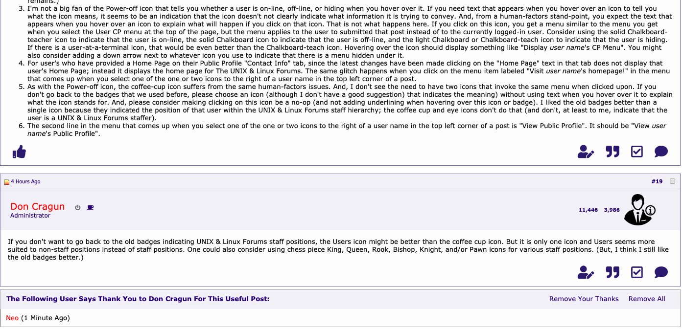
I'm not a big fan of the Power-off icon that tells you whether a user is on-line, off-line, or hiding when you hover over it. If you need text that appears when you hover over an icon to tell you what the icon means, it seems to be an indication that the icon doesn't not clearly indicate what information it is trying to convey. And, from a human-factors stand-point, you expect the text that appears when you hover over an icon to explain what will happen if you click on that icon. That is not what happens here. If you click on this icon, you get a menu similar to the menu you get when you select the User CP menu at the top of the page, but the menu applies to the user to submitted that post instead of to the currently logged-in user. Consider using the solid Chalkboard-teacher icon to indicate that the user is on-line, the solid Chalkboard icon to indicate that the user is off-line, and the light Chalkboard or Chalkboard-teach icon to indicate that the user is hiding. If there is a user-at-a-terminal icon, that would be even better than the Chalkboard-teach icon. Hovering over the icon should display something like "Display user name's CP Menu". You might also consider adding a down arrow next to whatever icon you use to indicate that there is a menu hidden under it.
For user's who have provided a Home Page on their Public Profile "Contact Info" tab, since the latest changes have been made clicking on the "Home Page" text in that tab does not display that user's Home Page; instead it displays the home page for The UNIX & Linux Forums. The same glitch happens when you click on the menu item labeled "Visit user name's homepage!" in the menu that comes up when you select one of the one or two icons to the right of a user name in the top left corner of a post.
As with the Power-off icon, the coffee-cup icon suffers from the same human-factors issues. And, I don't see the need to have two icons that invoke the same menu when clicked upon. If you don't go back to the badges that we used before, please choose an icon (although I don't have a good suggestion) that indicates the meaning) without using text when you hover over it to explain what the icon stands for. And, please consider making clicking on this icon be a no-op (and not adding underlining when hovering over this icon or badge). I liked the old badges better than a single icon because they indicated the position of that user within the UNIX & Linux Forums staff hierarchy; the coffee cup and eye icons don't do that (and don't, at least to me, indicate that the user is a UNIX & Linux Forums staffer).
The second line in the menu that comes up when you select one of the one or two icons to the right of a user name in the top left corner of a post is "View Public Profile". It should be "View user name's Public Profile".
If you don't want to go back to the old badges indicating UNIX & Linux Forums staff positions, the Users icon might be better than the coffee cup icon. But it is only one icon and Users seems more suited to non-staff positions instead of staff positions. One could also consider using chess piece King, Queen, Rook, Bishop, Knight, and/or Pawn icons for various staff positions. (But, I think I still like the old badges better.)